

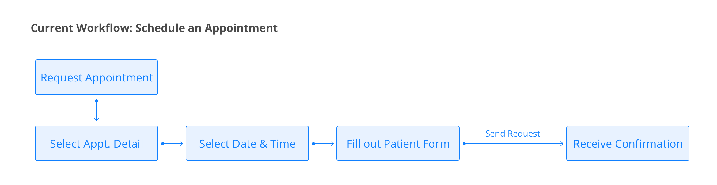
SR Schedule
Online Appointment Scheduling Tool
Project Length: April 2017 - Current
The goal of this project is to redesign the patient experience of SR Schedule, an online appointment scheduling tool. Research Deck.
Problem Framing
If you ask front desk staffs what their days look like, most of them will mention that they spend most of the time on the phone. Half of the time they are calling patients to confirm their appointments. The other half? Scheduling appointments with patients.
The average phone call to schedule an appointment takes over EIGHT minutes. To reduce time on phone and help staff member to interact with patients in the office, Solutionreach launched Limelight(now SR Schedule) at 2014. It integrates with the practice management software to give patients access to the full schedule and let them schedule appointments any time they want.
For the last few years, customers tried it out, got disappointed, and left. After heavy research, Solutionreach decided to redesign the scheduling system to earn those customers back.


My Role
As the only designer on the Schedule team, my responsibility is to oversee products from research to conception until launch with product manager, UX researcher and engineers throughout the entire product lifecycle. I work closely with client success team and marketing team to ensure the end to end user experience. Design tasks include discovering both patients and subscribers needs, convey research findings in mockups, delivering prototypes in different levels of fidelity, iterating on the existing product and building new features.
Research & Insight
We ran some key queries, interviewed office staffs, and tested the existing Limelight experience with patients in our research lab. Our goals were to understand the challenges patients faced when scheduling appointments, frustration offices had because of the lack of function and the workarounds they employed to solve the problem.
Our key takeaways were:
- Bounce rate on the patient scheduling page is 70%+. With some serious usability issues on appointment scheduling workflow, patients would rather call the office than dealing with the online scheduler;
- Current scheduling structure is too simple: no matter how patients get to the scheduling page, they have to go thru the same tedious steps. There are many opportunities and entry points we can capture in this experience.
- Some critical features are missing in current workflow. The office staffs still have to get on the phone to complete the request.
Based on the takeaways and business goals, we identified three high-level goals:
- General Usability: Clean up both workflow and interface for the scheduling experience
- Efficiency: Build a smart scheduling system that accelerates the progress in order to relieve patients of redundant and repetitive work.
- Powerful tool: Provide practices with a powerful backend setup that allows customization at different levels at no cost of user experience.
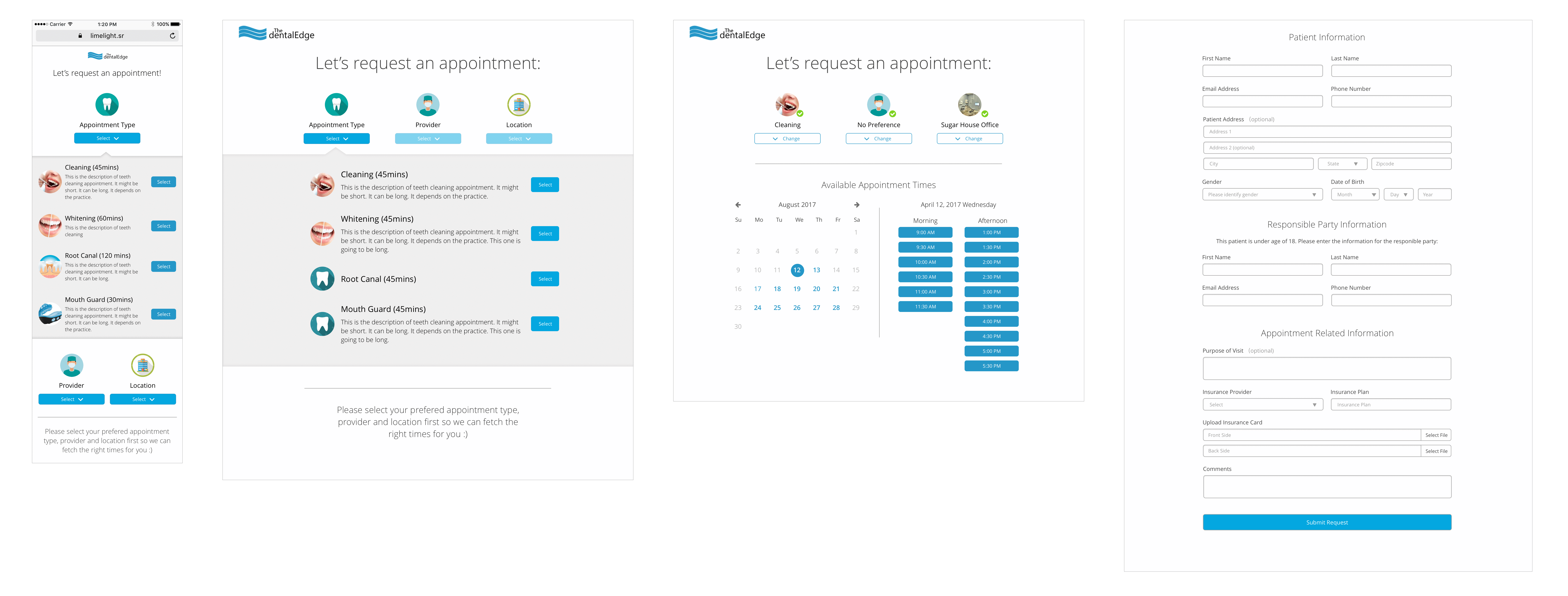
Stage 1: General Usability
Based on the usability test and customer feedbacks, we concluded 3 main issues with the current patient scheduling experience:
- The workflow doesn't fit patients' mindset;
- The layout is overwhelming and causes confusion ;
- The date/time selector is where patients spend most of their time at.
Here's how we fixed those problems using design thinking:
Rigid - Flexible
Patients are able to schedule the appointment by provider, location or appointment type, and only available options based on previous selection will be presented. Most of the time they choose the first one in the options, provider, and then being forced to pick by the order: location -> appointment type.

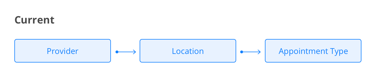
In many cases, the available options for appointment type are being narrowed down because of the previous selections and patients can’t find the one they want. They are cornered to the extreme case and have to go back and change the provider/location hoping they could find the right combination.


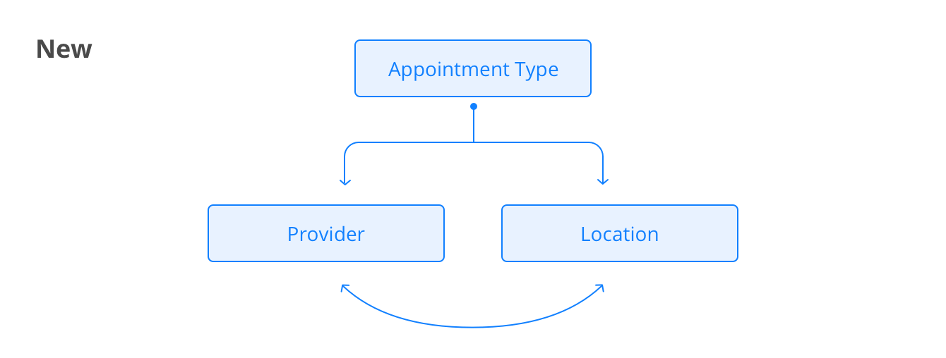
Based on the interview and survey results, we realized that when scheduling an appointment, some patients care more about location, others care more about provider; case varies from patient to patient, but they all know which appointment type they want.
Distracted - Focused
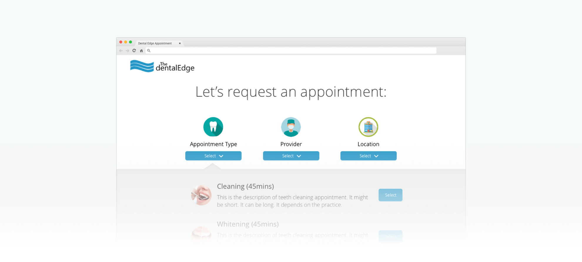
Currently, when a patient first lands on a page, he is exposed to all the actions he will need to take:
- Section1: Define appointment (provider, location & appointment type) ;
- Section 2: Schedule (select date & time);
- Section 3: Patient form (personal information, the purpose of visit, insurance information).

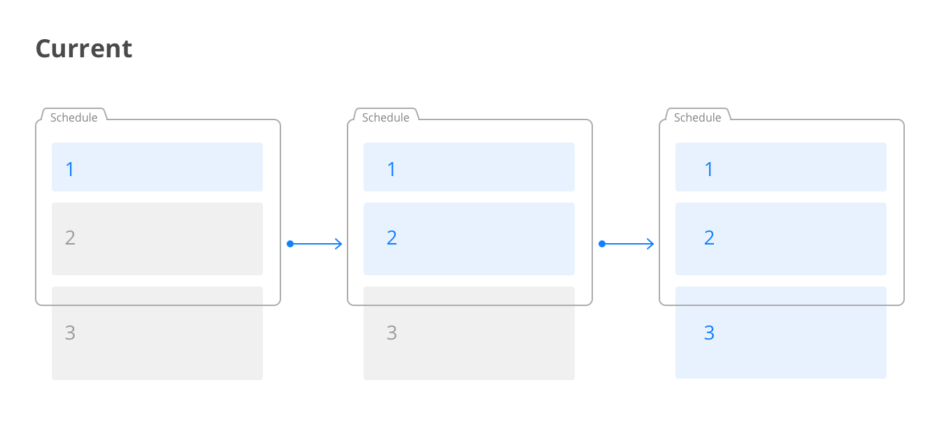
During the usability testing, we found participants are confused about the placeholder schedule and intimidated by how much work they need to do to complete the schedule.

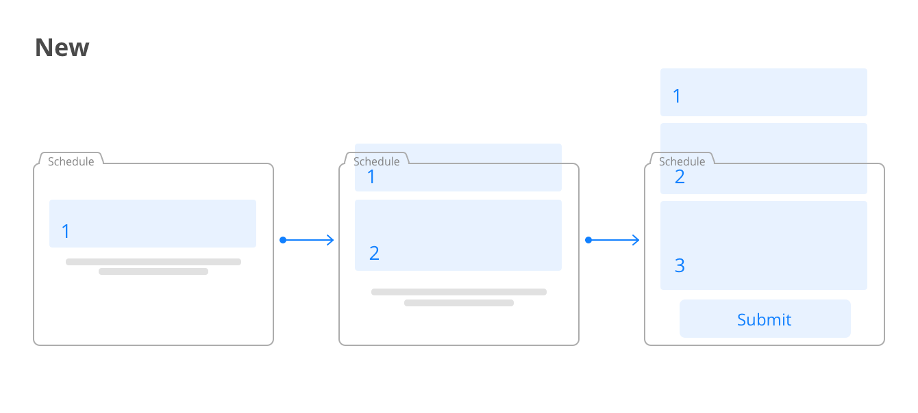
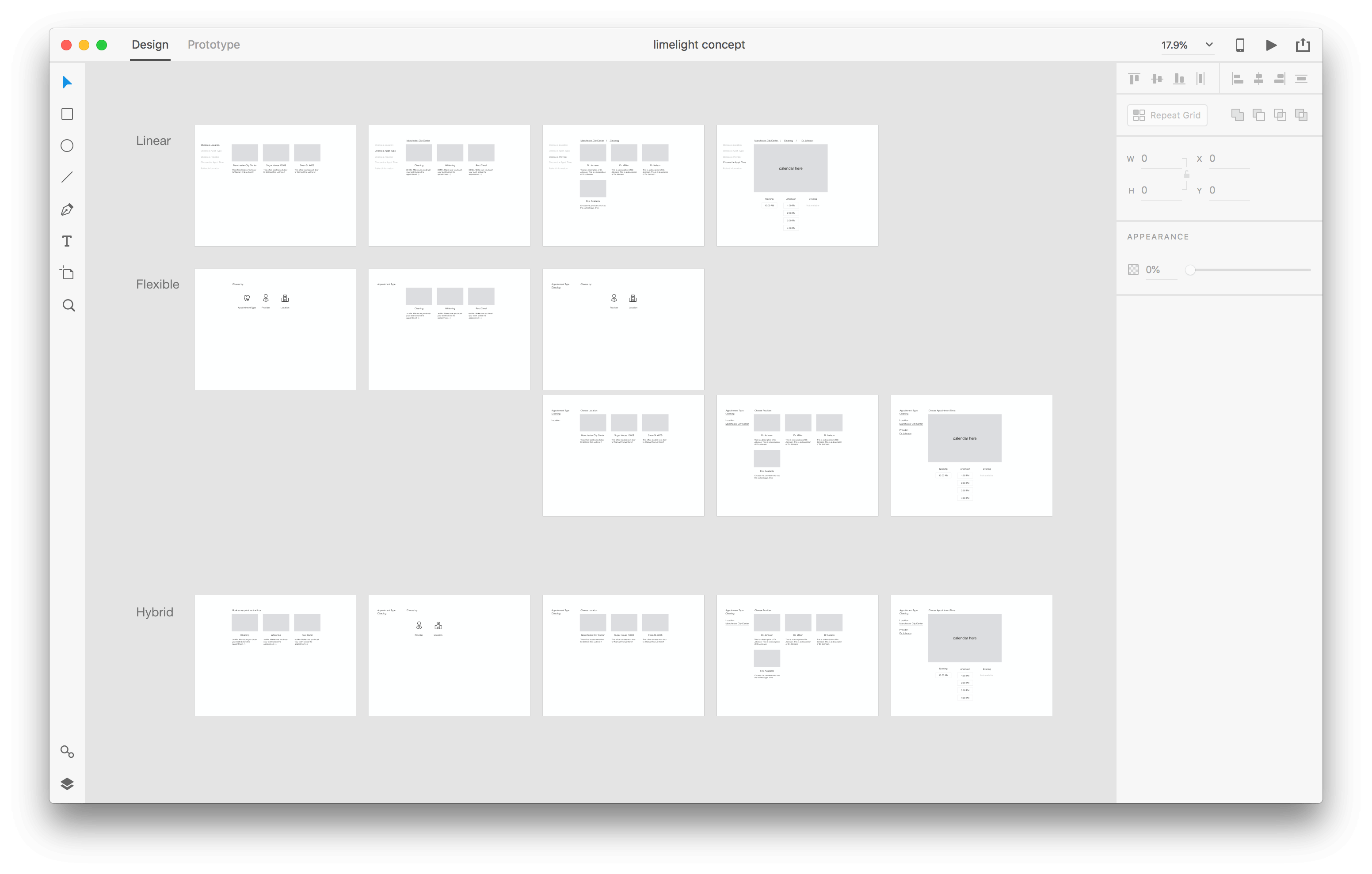
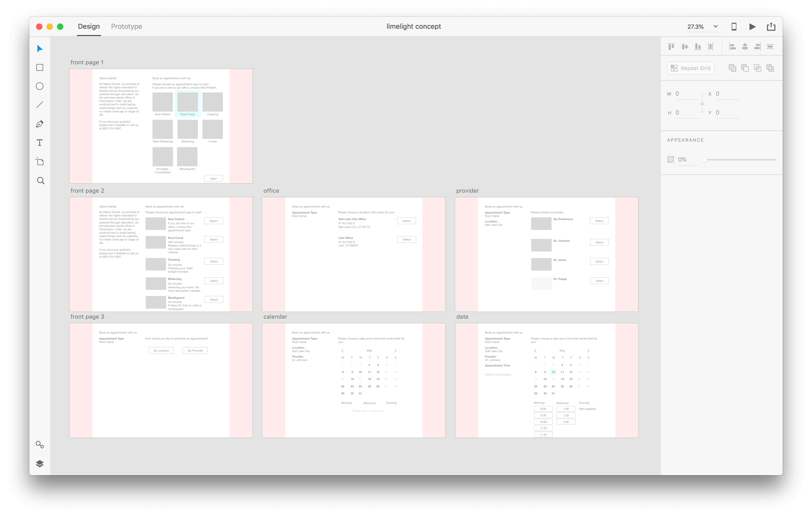
Instead of dumping all options into the canvas at once that creates a clutter and cognitive workload, we decided to take the progressive disclosure approach. We tested different UI patterns (ie. Steppers, wizards, and one page view) and decided to go with the one page design based on the nature of this task: patients need to constantly refer back to the previous selections and make changes accordingly.
Limited - Comprehensive
The current calendar allows patients to view available time slots by week. Every day is being divided into 3 sections: morning, afternoon, evening.

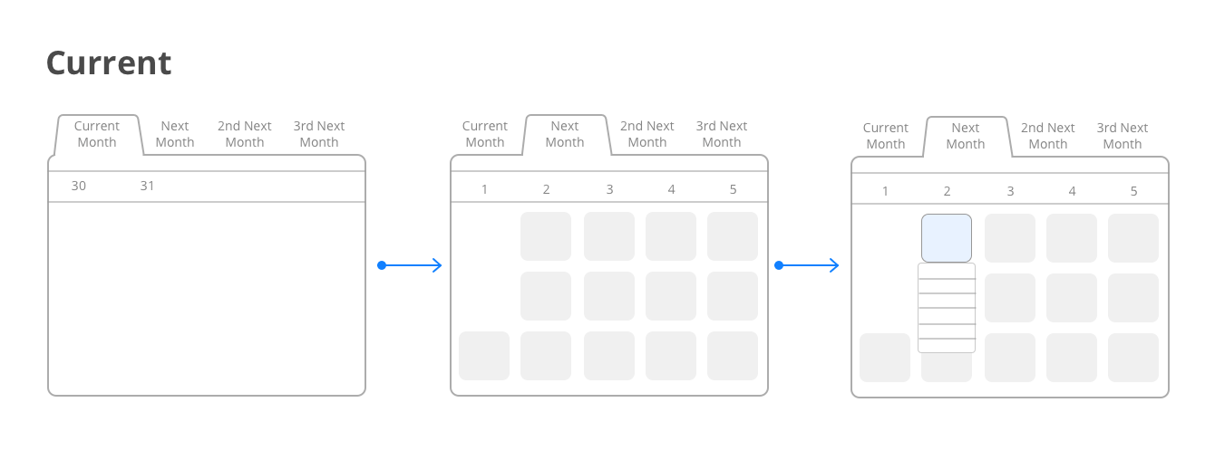
According to the test results, the calendar is working but the experience is really confusing and feels redundant.
- There is no design for the empty/zero-data state so patients think it’s broken when they land on a week where there is no appointment available.
- Patients have to take unnecessary steps to view the appointment availabilities.


I looked into almost all online appointment scheulders I could find to understand how patients use those tools and to learn the good and bad practices.


We want to provide a calendar that is powerful and initiative to use so patients can find the time that suits their need. Things patients are looking for in a calendar that help them decide are: AM/PM, which day of the week, the earliest availability, et.
Result
By the end of the design session, we see a completion rate boost from 15% to about 30%. This is what the design ended up looking like:

Stage 2: Improve Efficiency
WHY are we building an online scheduling tool? The mutual outcome for both healthcare provider and patients is to schedule appointment faster and use it more.
For our customers, the more patient scheduling appointment online, the less time they will waste on talking on phone, and the more profit they will get.
The current workflow is working…but it’s not optimal. Many patients complain about the experience and end up leaving in the middle of the process and call the office.

The goal here is to make the experience fluent and easy enough, that it accelerates the process and eliminates unnecessary steps for patients. The current patient experience is crude by oversimplifying the process and ignoring the “WHO” in the experience. How do patients get to that page? Who are they? What are they expecting to see?
By asking all those questions, we proposed a fully integrated experience for the patients.

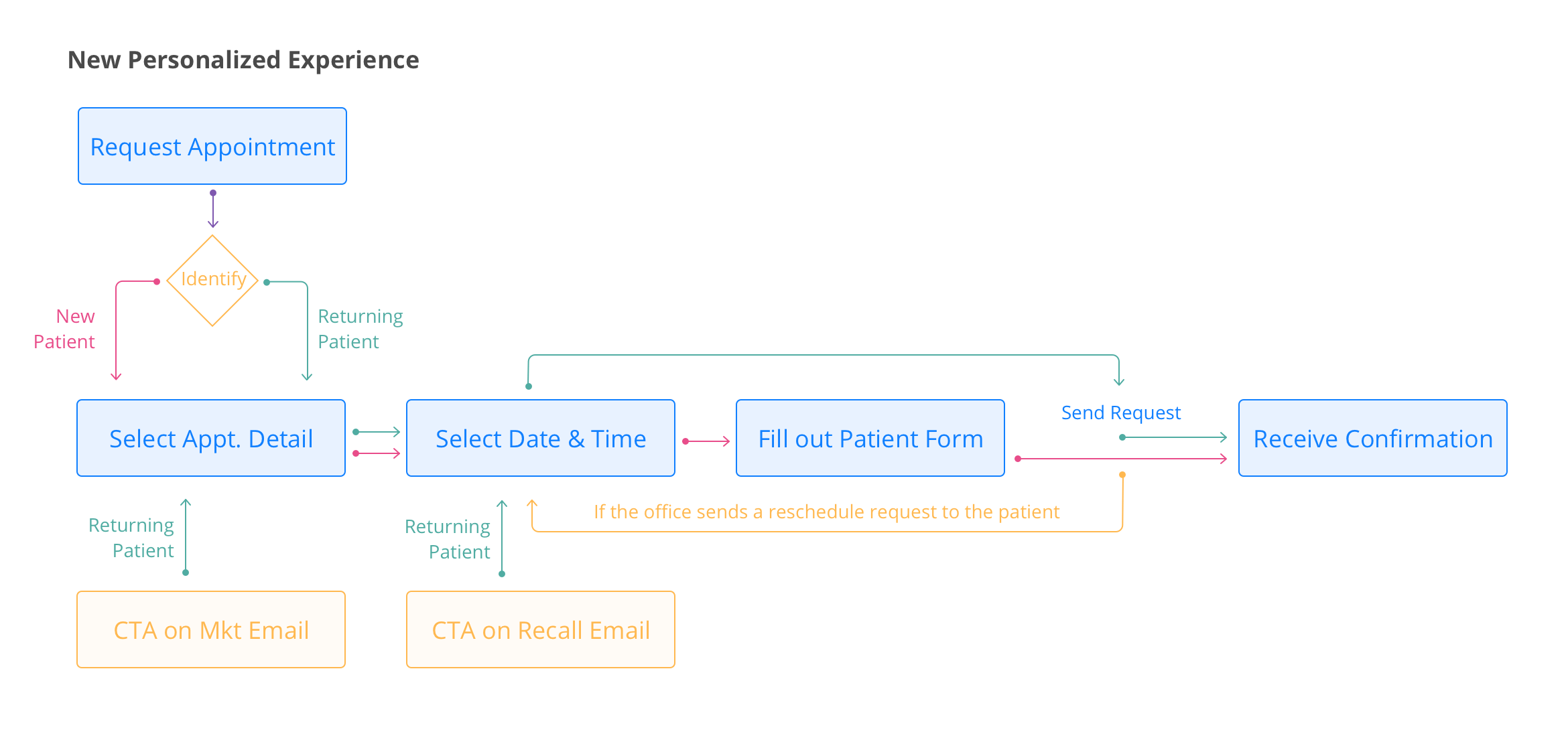
We identified pains in the user journey and came up with 3 goals to improve the user experience and improve efficiency:
- Know the user;
- Make educated guess;
- Reduce redundant work.
By identifying the patients before they start the scheduling process, we successfully reduced the time patients spend on the form page and helped the practice to get better data. The completion rate boost from 30% to about 50%.
I'd love to talk about how we made this change in person.